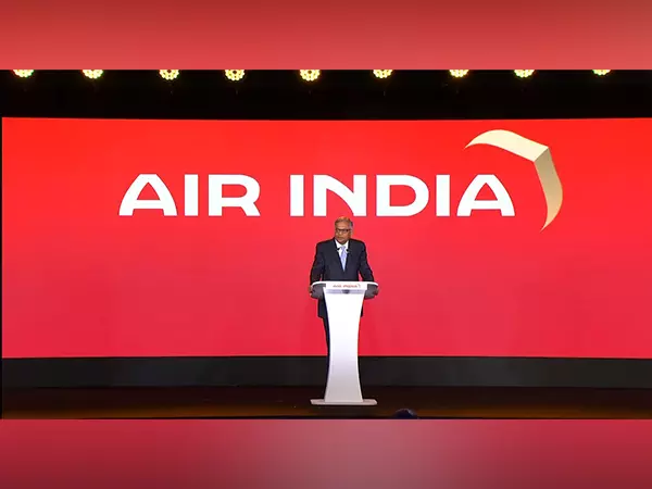
As AI sports new logo, here’s the good, bad and ugly of airline logos globally
Some critics have panned the new Air India logo, saying it is uninspiring or unclear; perhaps the most debated point is what the symbol beside the brand name denotes

The new logo of Air India unveiled last week has evoked mixed reactions, ranging from those who believe it is a refreshing change to those who are completely confused about what it means.
Some critics have panned it, saying it is uninspiring or unclear. Perhaps the most debated point is what exactly the symbol beside the brand name denotes. Is it a bird? Is it a plane? Or perhaps, a gilder?
According to Joseph Foley of creativebloq.com, “It’s a gold window. Or at least part of a window viewed at an unusual angle. But you would kind of have to be told that to know. I don’t think this new design will make our pick of the best airline logos,” Foley, a project manager at London and Buenos Aires-based design and branding agency Hermana Creatives, said.
Also read: IndiGo's growing market share raises concerns of monopoly in Indian aviation
At The Federal, we compiled a list of the best and the not-so-good airline logos sourced from various lists.
Some of the best
Lufthansa: The crane in flight against the blue background is simple and iconic. Its simple and clean design makes it convenient for the digital world.
Virgin Atlantic: According to DesignShack, the logo for Virgin Airlines has not been explicitly made for an airline. It’s a logo that represents an entire corporation of multiple brands. The founder of the airline, Sir Richard Branson, has decided to design a “stylishly simple” logo and chose a signature-style logo that was initially scribbled on a paper napkin.
Air New Zealand: The koru symbol is inspired by the Maori culture and represents a new fern leaf unfurling, signifying new life, growth, and renewal.
Qantas: The flying kangaroo is instantly recognisable and is the national animal of Australia.
British Airways: DesignShack says British Airways’ logo is simple yet classy and that minimalism never goes out of style. It uses a classic font with a ribbon symbol, which is used to represent the speed bird symbol used by Imperial Airways back in 1932.
And the not so good
Fastjet: Its African Grey Parrot emblem puzzled people, as the parrot is not traditionally associated with speed or efficiency. Fastjet operates out of Zimbabwe and South Africa.
Spirit Airlines: This is an ultra-low-cost airline based in Florida, United States. The airline’s name is written across the aircraft with a yellow background. While its brand relies on being cost-effective, some critics believe its logo and branding should be more sophisticated.
PIA (Pakistan International Airlines): The logo has been criticised for being outdated and failing to portray Pakistan’s rich culture.
TAP Portugal: Despite being redesigned, some reviewers felt the former designs were antiquated and that the new ones needed to be more innovative.
Air Canada: According to Designshack.net, Air Canada managed to modernise its logo over the years but still kept its maple leaf symbol attached. The logo was refreshed in 2017. However, using the maple leaf symbol makes it look quite dated and unattractive. They could’ve used a much simpler version of the symbol.
Ingredients for a good logo
According to logo designers, an airline logo should be crucial in moulding the public perception of the airline. While there is no specific formula that dictates what an airline logo must contain, the following guidelines should help steer the design process: Simple logos are easier to remember and recognise. In addition, they are more adaptable, as they can be displayed in various contexts, from aircraft tails to ticket stubs.
The logo should be pertinent to the brand’s ethos and values. For instance, a premium airline may opt for a more intricate design, whereas a budget airline may opt for a more playful and vibrant logo.
Also read: Indian aviation is bleeding; it’s time to roll out Open Skies Policy 2.0
Symbolism: Logos may include symbols or elements associated with the industry (such as wings, aeroplanes, or birds) or the country or region represented by the airline (such as national animals, monuments, or cultural landmarks). With so many airlines operating around the globe, a unique and distinguishable logo helps an airline stand out and be readily identified.
If the airline operates globally, the logo must not convey a negative or inappropriate message in different cultures. The logo should possess adaptability. It should look good in black and white and in colour. It must be scalable, appearing equally well on a billboard and a mobile app.
Colour Selection: Colours can evoke emotion. Blue may represent dependability and trustworthiness, while red and green may represent passion and vitality. Colours should be distinct and congruent with the brand strategy of the airline.
If the logo includes the airline’s name or initials, the typography should be clear and legible from afar. Additionally, it should be commensurate with the airline’s desired brand image. Brand identities are subject to change over time. A logo for an airline should be timeless, but it should also be able to adapt to shifting times and trends.
Once a logo has been chosen, it should be utilised uniformly across all platforms and materials, including the website, advertising, in-flight magazines, and placemats. The most effective logos frequently evoke an emotional response from the viewer. This could imply adventure, safety, comfort, or prestige for airlines.
When designing or selecting an airline logo, it is also advisable to conduct market research to gauge the target audience’s response. This helps ensure that the logo positively affects its intended audience.
